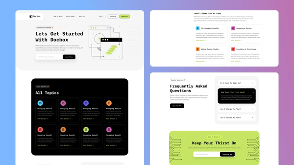

A Starlight documentation theme inspired by the [shadcn/ui](https://ui.shadcn.com) documentation design. Clean, minimal, and professional — built with a CSS-first architecture that keeps your project lightweight and easy to maintain.
What it is
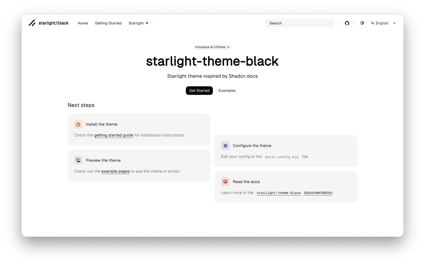
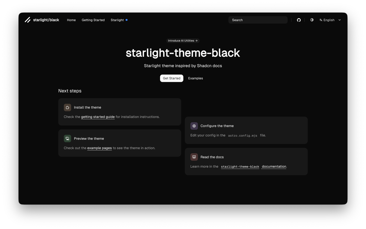
starlight-theme-black is a Starlight plugin that transforms your documentation site to match the aesthetic of shadcn/ui's docs. It ships with Geist Sans and Geist Mono fonts, a dark/light color system based on oklch tokens, and a carefully crafted set of component overrides that feel native to Starlight.
No Tailwind CSS required. All styling is pure CSS using cascade layers for predictable overrides.
Features
Design
- Shadcn/ui-inspired visual language — clean typography, subtle borders, muted color palette
- Dark and light mode with automatic system preference detection
- Geist Sans and Geist Mono loaded via Astro's Font API
- oklch color tokens with full theme customization through CSS custom properties
Layout
- CSS-first architecture — ~700 lines of CSS replace what would normally be 15+ template overrides
- Responsive sidebar with scroll-fade animations
- Blue dot indicators for active items (instead of text badges)
- Mobile navigation with backdrop blur overlay and hamburger-to-X animation
Markdown Actions
- "Copy page" button next to every page title — copies the full Markdown source to clipboard
- AI agent dropdown with ChatGPT, V0, Claude, and Scira shortcuts (official SVG icons)
- Per-page frontmatter overrides to enable/disable or customize agents per page
- Fully extensible — add your own agents with custom labels, URLs, and SVG icons
Navigation
- Configurable navbar links with external/internal links, badges, and i18n support
- Slug shorthand for internal links (label inferred from frontmatter)
- Per-locale label translations for multilingual sites
Internationalization
- Built-in i18n support via Starlight's native locale system
- Navbar link labels and badges can be translated per locale
- Demo includes English and Spanish examples
Hero layouts
- 5 layout variants: centered, media-top, media-left, media-right, banner
- Optional announcement banner with link
Developer experience
- TypeScript-first configuration with full autocomplete
- Cascade layers (`black` layer) for predictable CSS override order
- Starlight's built-in components (Steps, Tabs, Cards, etc.) styled to match the theme
- Zero runtime JavaScript for core styling — only the dropdown and copy-to-clipboard need client scripts