Astro Photo Folio — Minimal Photography Portfolio & Blog
A fast, elegant, privacy-first portfolio for photographers — and the writers behind the lens. Astro Photo Folio pairs a refined editorial aesthetic with serious engineering: a fully static build that deploys free on Cloudflare, a polished mobile experience, responsive galleries with an instant-open lightbox, two blogs, and a first-party view counter that needs no third-party analytics. It ships looking complete — generated placeholder photography and example posts included — so you can see the finished experience the moment you run it, then swap in your own name, links, and images.
Why you'll love it
• Optimized for mobile, genuinely. A mobile-first, responsive layout that adapts from a fixed sidebar on desktop to a clean top bar + hamburger menu on phones and tablets. The full-height layout uses dynamic viewport units (svh/dvh) so it doesn't jump when the mobile address bar hides or shows, scroll-bounce is tamed, and tap targets, fluid type, and swipe gestures make it feel native on touch.
• Looks like a gallery, performs like a static site. Images are optimized to WebP at build time, stylesheets are inlined, and fonts are metric-matched — engineered to eliminate layout shift (CLS) and deliver excellent Core Web Vitals, even on a phone over a slow network.
• An instant, tactile lightbox. Click or tap any photo and it opens immediately from the already-cached thumbnail, then upgrades in place to a viewport-matched rendition. Keyboard arrows, swipe gestures, and captions included — no janky full-size download wait.
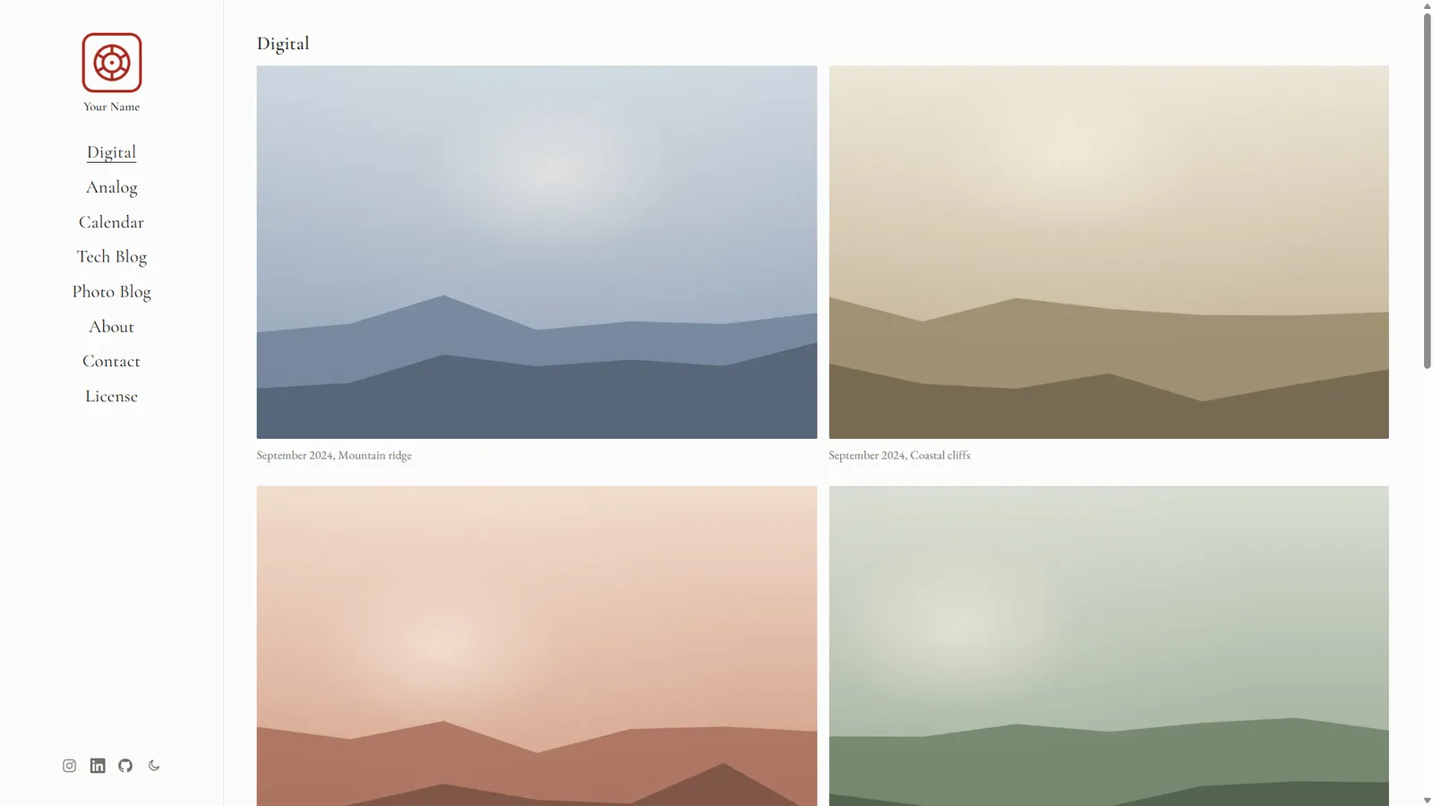
• Two galleries + a photo-a-month calendar. Separate Digital and Analog (film) collections, plus a Calendar that surfaces one image per month. Galleries auto-order by date (newest first), so adding an older shot never means renaming files.
• Built-in writing, done right. Two Markdown/MDX blogs — a Tech Blog and a Photo Blog — with code syntax highlighting, a native share button, and drop-in Photo and Gallery components for image-rich posts.
Everything that's included
Pages & layout
• Digital · Analog · Calendar · Tech Blog · Photo Blog · About · Contact · License · Privacy
• Mobile-optimized, responsive layout: a fixed left sidebar on desktop that collapses to a clean top bar + hamburger menu on tablet and phone, with breakpoints tuned all the way down to small screens
• Stable full-height layout on mobile browsers (dynamic svh/dvh viewport units), contained over-scroll, and reduced-motion support
• Light/dark theme toggle with no flash of the wrong theme and persisted preference
Design
• Timeless serif typography (self-hosted Cormorant Garamond + EB Garamond — no external font requests), with fluid sizing that scales smoothly across devices
• Tasteful generated placeholder photography, a brand "seal" mark, favicons, and a social-share image
• Optional second-script name (e.g. a Chinese 名字) support, hidden until you enable it
SEO
• Descriptive, text-driven image alt text for real photo SEO
Privacy
• A thoughtful, ready-to-edit Privacy Policy written with GDPR / CCPA / PIPEDA expectations in mind
Content protection
• Block AI-training and bulk-scraper crawlers — enforced at the edge (the Worker returns a 403), so your photographs stay out of training datasets while search engines (incl. Google Images) pass through untouched
• A strict Content-Security-Policy and hot-link protection for your images
Built for performance & simplicity
• Astro 6, fully static output — perfect for Cloudflare's free tier (also works on any static host)
• Fast on mobile networks: lean self-hosted fonts, inlined critical CSS, optimized WebP imagery, and zero render-blocking analytics
• One configuration file (src/config.ts) drives the brand, titles, navigation, social links, and SEO
• Clean, well-commented code that's easy to extend; the optional Worker + D1 are entirely opt-in
Who it's for
Photographers, filmmakers, designers, and visual creatives who want a portfolio that doubles as a publication — beautiful, lightning-fast on every device, privacy-respecting, and yours to own end to end. No page builders, no subscriptions, no tracking.
Get started in minutes
1. Use the GitHub template (or clone the repo) and run npm install && npm run dev.
2. Edit src/config.ts, drop your photos into src/assets/, and write a post.
3. Deploy
Please also check out this theme in production https://xdqin.com/
Requirements: Node 22.12+ · License: open-source (see the included LICENSE) · Stack: Astro 6.