
🌈 Design Philosophy
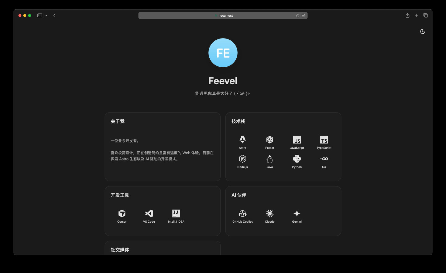
This project is built upon the dual principles of "Airy & Orderly". It is a minimalist UI theme crafted with deliberate whitespace, soft glass-like surfaces, and breathable layouts, allowing content to shine with calmness, clarity, and warmth.
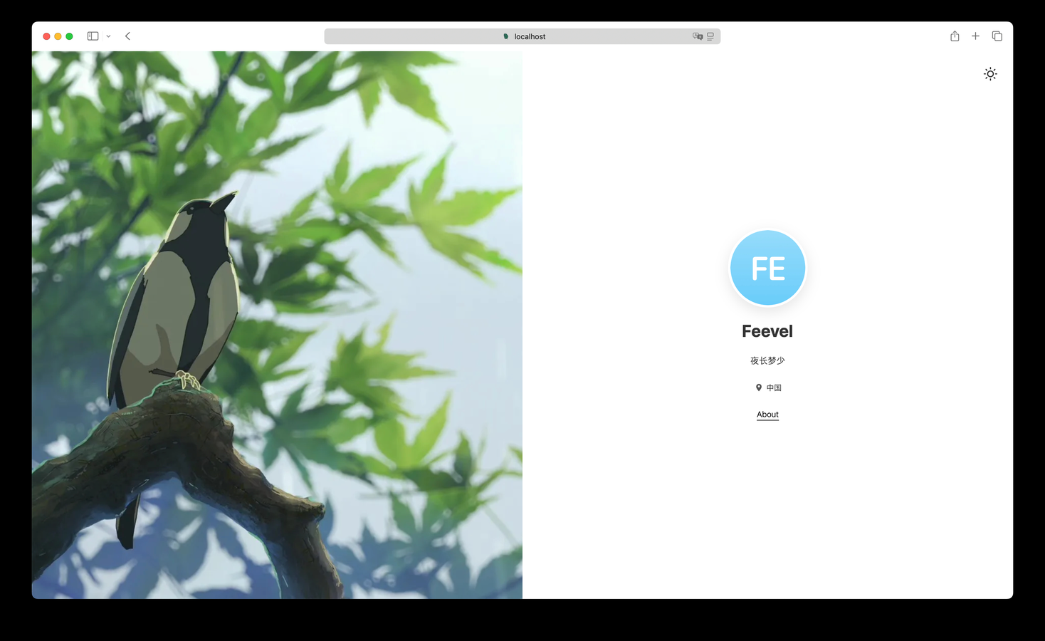
- Minimalism & Immersion: Strips away decorative noise to focus on content. Uses a Split-Screen Layout (50% visual, 50% content) on desktop for an immersive experience, which gracefully stacks on mobile.
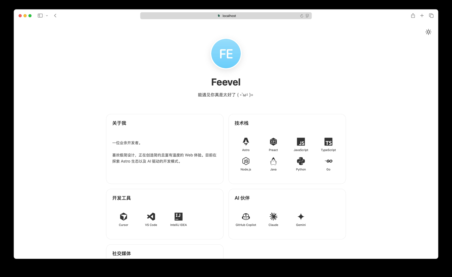
- Bento Grid Architecture: Content is organized into a modular Bento Grid, transforming fragmented information into a rhythmic, orderly visual flow.
- Glassmorphism & Texture: Utilizes frosted glass effects (blur) and subtle shadows to create depth and a physical, tactile feel (High Quality Materiality).
- Emotional Temperature: The core interface maintains a neutral monochromatic palette, while injecting warmth and a sense of breathability at key touchpoints.
🛠️ Tech Stack
- Astro 5.0+: Modern web framework delivering a default Zero-JS runtime for lightning-fast First Contentful Paint (FCP).
- Preact: Lightweight React alternative for handling complex, local interactive "Islands" (e.g., Announcements).
- TypeScript: Full type safety throughout the codebase for a robust development experience.
- CSS Variables: Native CSS custom properties for a flexible, high-performance theming system.
✨ Features
- Hybrid Architecture: Combines static site speed with Preact Islands for interactive elements, ensuring a perfect balance of performance and interactivity.
- Configuration Driven: Navigation links, site configuration, and content data are all managed via yaml. Modifications take effect immediately.
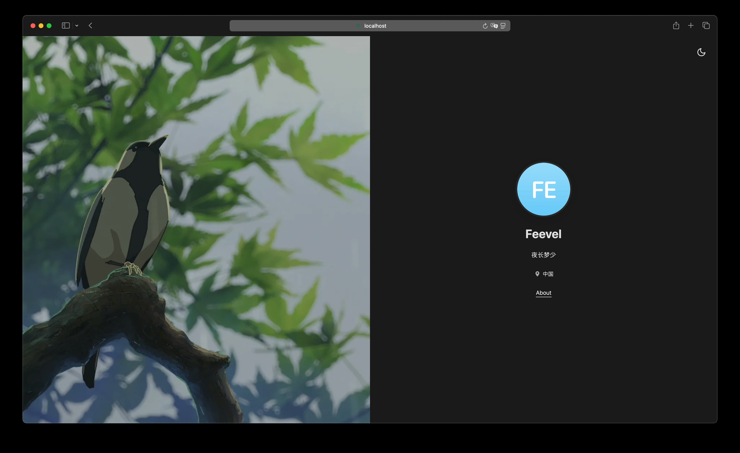
- Dark Mode Support: Built-in dark theme supporting system preference syncing or one-click toggling, with local persistence of user preferences.
- Responsive & Adaptive: Optimized single-column layout for mobile/tablet that expands into a full visual experience on desktop.
- Modular Content: The Bento-style layout allows for flexible, configurable content modules that maintain visual order.