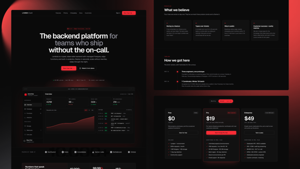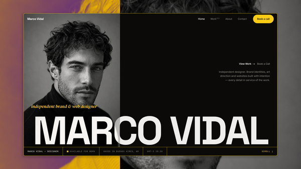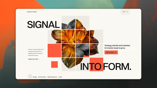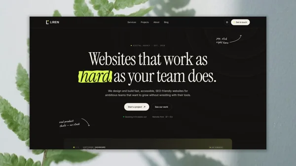

Lambda Minimal is an editorial design-studio template built on Astro 6 and Tailwind CSS v4. It ships with every page wired up, every content collection structured, every interactive component accessible, and every SEO detail in place, so you can focus on presenting your studio's work and point of view instead of scaffolding your site.
Lambda Minimal stays fast by default: no heavy animation libraries, no client-side framework taking over, no unnecessary overhead. Alpine.js handles the few interactive pieces — mobile menu, theme toggle, work and journal filters, services FAQ — and disappears everywhere else. What you get is a quiet editorial aesthetic, a performance-first architecture, and a codebase that stays out of your way.
Who is this template for?
Lambda Minimal is the right fit for:
Design studios and small creative practices that want a complete, editorial web presence — work archive, studio page, journal, services, contact — ready to ship without months of design and engineering.
Freelance designers and independent art directors looking for a quiet, considered portfolio site that presents case studies, writing, and services with credibility rather than noise.
Agencies and developers building studio sites for clients who want a well-structured, type-safe starting point with a token-driven design system, MDX content collections, and clean component boundaries that survive a hand-off.
Teams that value performance and accessibility — Lighthouse 99+ on mobile and desktop on the production deploy, WCAG AA contrast verified across every surface in both light and dark, and a font-loading strategy designed to avoid swap layout shift.
Features
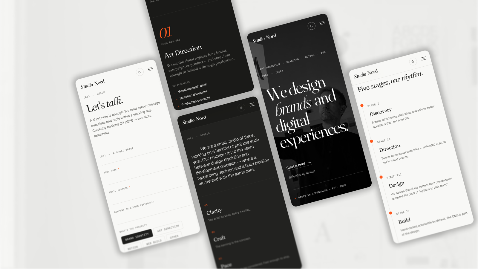
- Light + dark theme with no-flash boot: Token-driven dark mode applied via html[data-theme] with an inline boot script that sets the theme before first paint, and theme continuity through View Transitions. The light palette inverts to a deliberate dark companion — separate accent text token, separate hairline, separate heading color — not just a CSS variable filter pass.
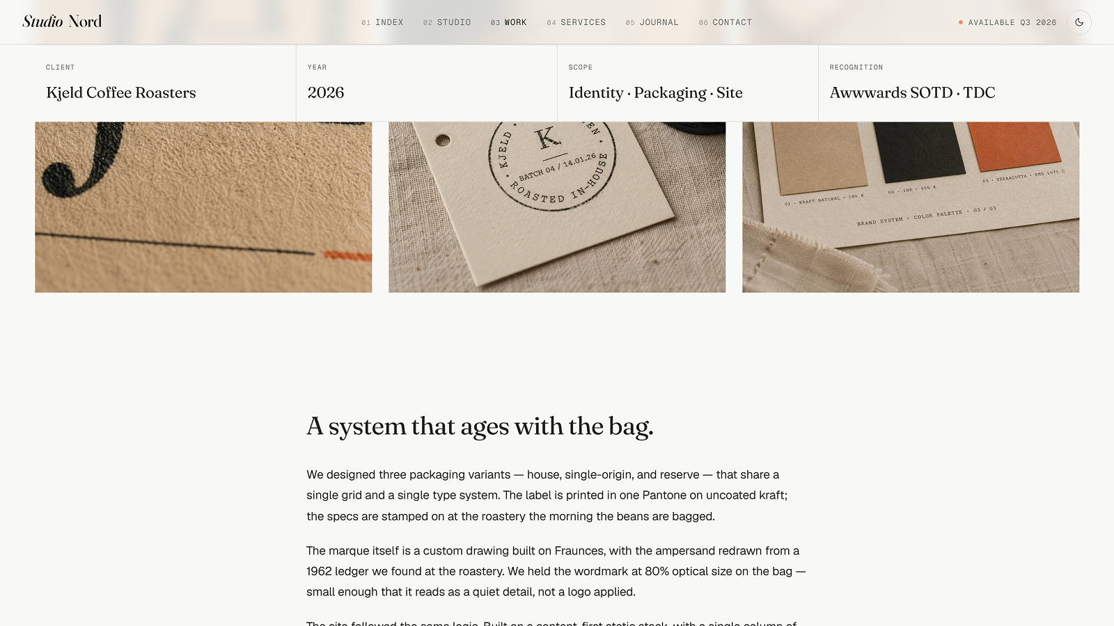
- MDX Work collection with editorial detail pages: Case studies with Zod-typed frontmatter (client, year, type, chips, scope, recognition, credits). Each entry can ship two cover images (4:5 archive thumb plus a wide hero) and a separate variant for the asymmetric home spread, with a sticky info bar, navigation, and an in-production stub template for unfinished entries.
- MDX Journal collection: Long-form writing with featured entry highlighting, tag filtering (Process, Craft, Tools, Industry, Studio), author cards, related entries, and per-entry hero images. Same in-production stub pattern as Work for drafts that aren't ready to publish.
- Prose pages content collection: Drop a Markdown/MDX file into src/content/pages/ and the file name becomes the URL (privacy.mdx → /privacy). Ships with four pre-written legal/back-of-book pages — Privacy, Terms, Accessibility, Colophon — styled via a shared .prose typography class. Add more by dropping a file; no routing or component work needed.
- Self-hosted editorial type system: Fraunces self-hosted by hand with the opsz (optical-size) axis intact plus a metric-matched Georgia fallback face, Geist and Geist Mono self-hosted via Astro's Fonts API with metric-adjusted fallbacks. Zero third-party font requests at runtime, designed to avoid swap layout shift.
- Token-driven design system: Every color, typography size, tracking, line-height, container width, and motion duration lives in @theme tokens in src/styles/theme.css. Change a token once and every utility built from it updates site-wide — light and dark in lockstep.
- View Transitions: Enabled globally via ClientRouter, with theme attribute and scroll-lock continuity wired in so the dark/light state survives navigation cleanly. Add transition names to specific elements for named animations across page navigations.
- SEO complete: Title tags, meta description, canonical URLs, Open Graph, Twitter Cards, and JSON-LD Schema.org (Organization on every page, WebSite on home, Article on every journal entry) handled from a single layout. Pass props per page, done.
- Reveal-on-scroll system: Opt in by adding data-animate to any element; an IntersectionObserver applies .is-in once on intersect, with separate travel distances for text, image-bearing cards, and press/award rows. Honors prefers-reduced-motion and includes a dev-mode safety net for above-the-fold elements.
- Type-safe content and configuration: All studio copy — site info, navigation, services, work archive metadata, journal entries, contact form fields, footer groups — lives in typed TypeScript files under src/data/. Change a value once, every page updates.
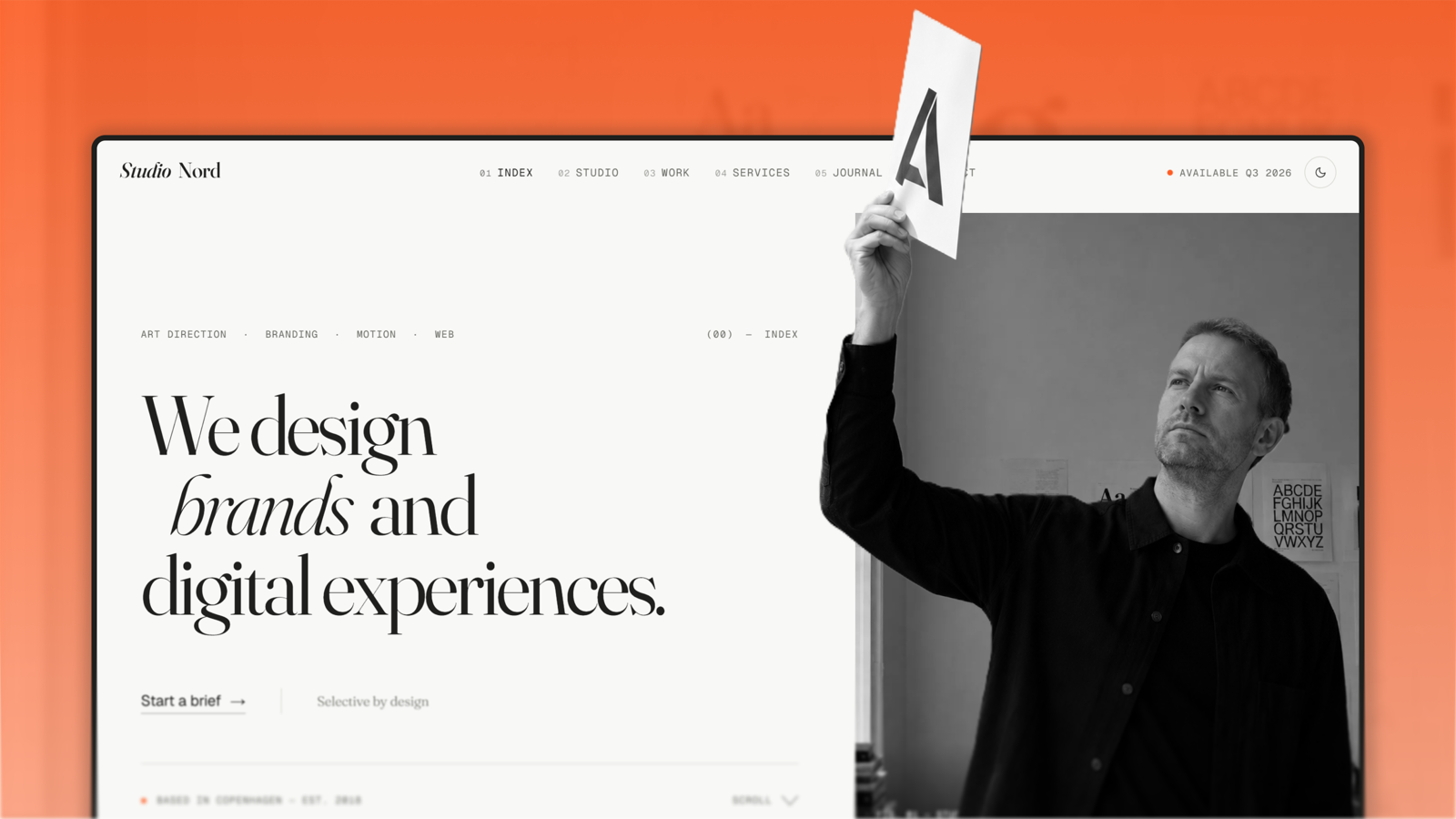
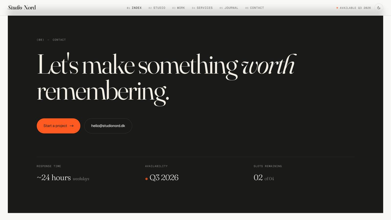
- Editorial layout details: Asymmetric featured-work spread on the home page, drop cap on the studio philosophy intro, marginalia notes, sticky info bar on case studies, dark inversion contact CTA, fig-caption photo captions — the small editorial details a generic studio template usually skips.
Tech Stack
- Astro 6 — static output, fully typed, minimal client JS
- Tailwind CSS v4 — CSS-first configuration via @theme tokens
- Alpine.js 3 — reactive interactions for mobile menu, theme toggle, work + journal filters, services FAQ
- TypeScript (strict mode)
- MDX — full component support in work, journal, and pages collections
- astro:assets — automatic WebP, responsive srcset, lazy loading
- Astro Fonts API — self-hosted Geist + Geist Mono with metric-adjusted fallbacks (Fraunces self-hosted by hand to preserve its optical-size axis)
- @astrojs/sitemap — auto-generated on every build
Pages & Sections
- Home: Hero with editorial portrait, asymmetric featured-work spread, studio statement with three values, services preview, clients marquee band, awards list, featured journal entries, testimonials, dark inversion contact CTA.
- Studio: Hero with optical-size display heading, studio image, philosophy with drop cap and marginalia notes, team grid, press list, availability band.
- Work: Filterable archive grid with category tabs (Branding, Motion, Web, Print). Each work detail page includes a sticky info bar, hero image, editorial MDX body, credits block, and prev/next pager.
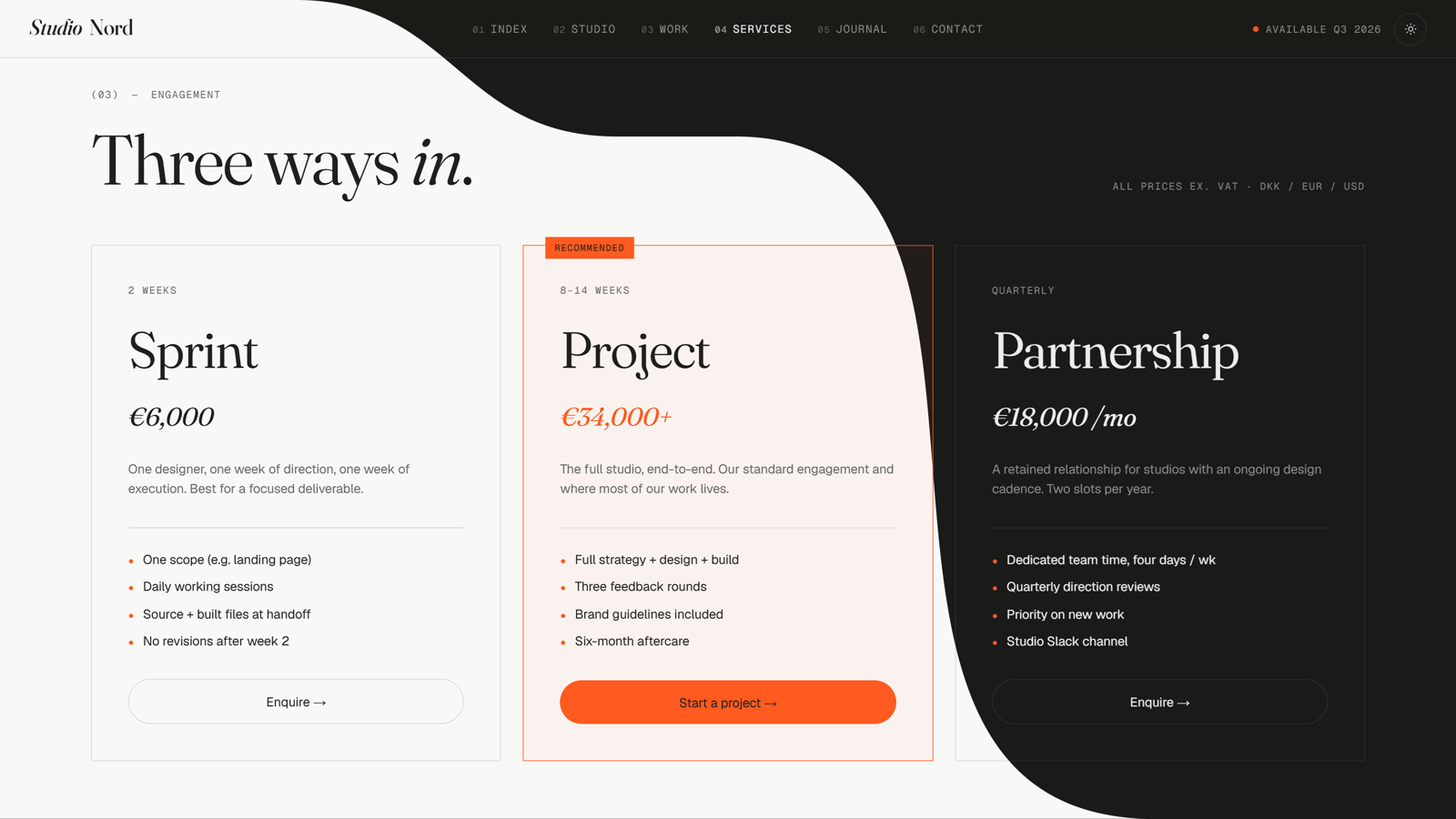
- Services: Hero, four service blocks (Art Direction, Brand Identity, Motion Direction, Editorial Websites) with deliverables and pricing, engagement tiers, process steps, FAQ accordion.
- Journal: Featured entry highlight, full entry listing with tag filters. Each journal entry includes hero image, author card, related entries, and tag plus read-time metadata.
- Contact: Two-column layout with contact form (project type, budget, brief) and studio info aside (email, phone, address, hours, availability). Form is ready to wire to Formspree, Web3Forms, or Netlify Forms.
- Prose pages: Privacy, Terms, Accessibility, and Colophon — added via the pages content collection at src/content/pages/, rendered by a single [slug].astro route.
- 404: Custom not-found page that matches the rest of the site's aesthetic.
- Style guide: Internal token documentation page (noindex), useful while customizing.
Performance & Accessibility
Lighthouse 99+ on mobile and desktop on the production Netlify deploy, across performance, accessibility, SEO, and best practices. Fonts self-hosted with metric-adjusted fallbacks designed to avoid swap layout shift. Hero images preloaded with exact srcset match. No render-blocking scripts. Fully static output.
WCAG AA contrast verified across every text token in both light and dark modes (text, text-muted, accent on light/dark backgrounds, dark-text on dark-bg, on-accent on accent). Heading hierarchy correct on every page. Landmark regions in place. prefers-reduced-motion honored by the reveal-on-scroll system and all CSS transitions. Focus states visible throughout. The theme toggle is fully keyboard-accessible.
Additional Highlights
- Light-first design system inverted to a warm dark register — dark mode is not a CSS variable filter pass but a deliberate companion palette with its own accent text token, hairline, and heading color
- font-display: swap on every font family, with metric-adjusted fallbacks for both Geist families and a Georgia-mapped Fraunces Fallback face
- Semantic HTML throughout, correct heading hierarchy, landmark regions, ARIA where needed
- Zero-config deploy to Netlify, Vercel, Cloudflare Pages, or any static host
- Single config file (src/data/site.ts) for all site-wide settings: studio name, legal name, address, social links, navigation, footer groups, utility links
- Editorial details a generic studio template usually skips — drop cap on philosophy intro, opsz=144 display headings, sticky info bar on case studies, fig-caption photo captions, marginalia notes, dark inversion contact block, asymmetric featured-work grid