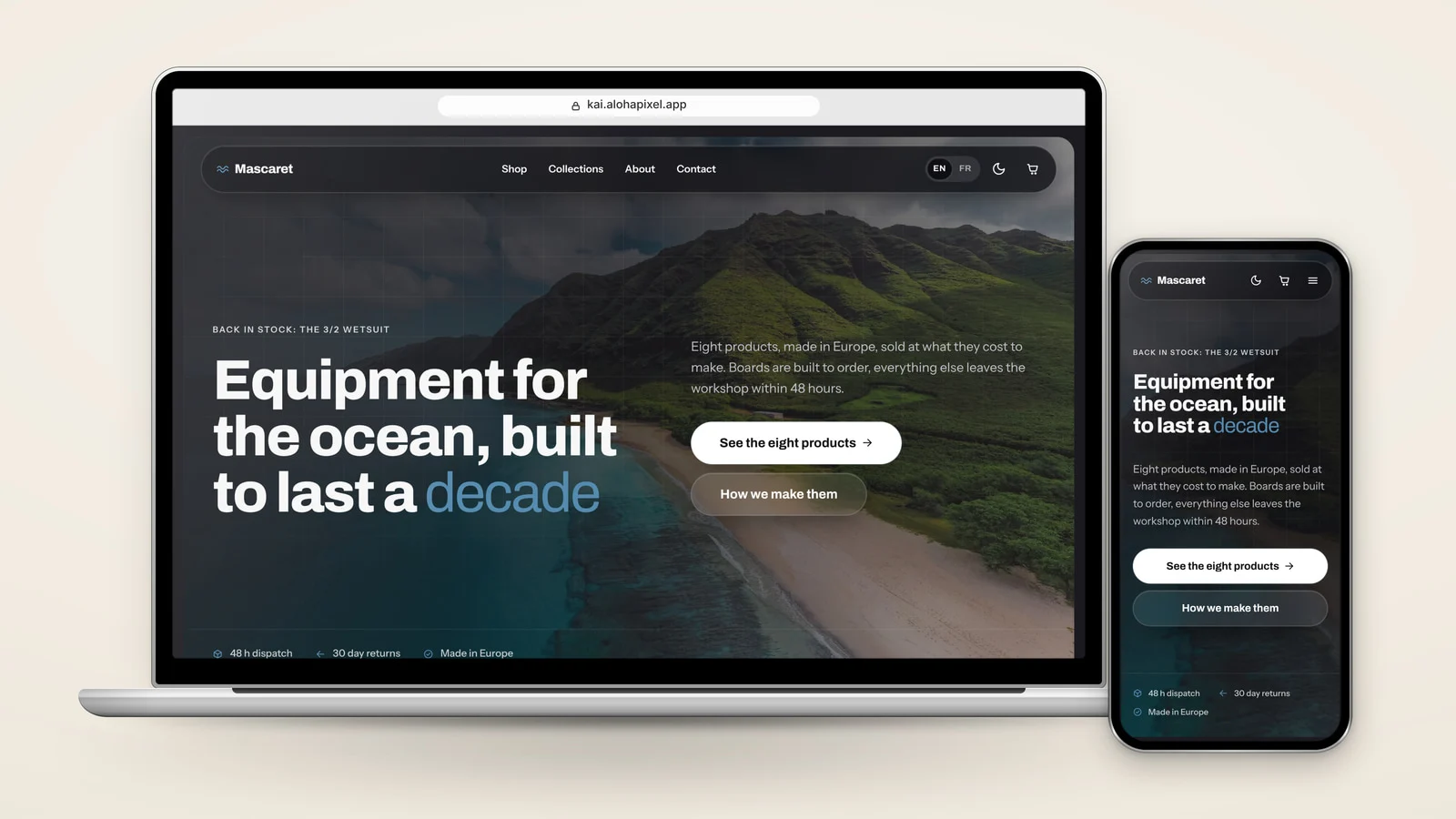
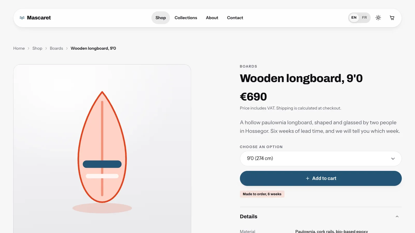
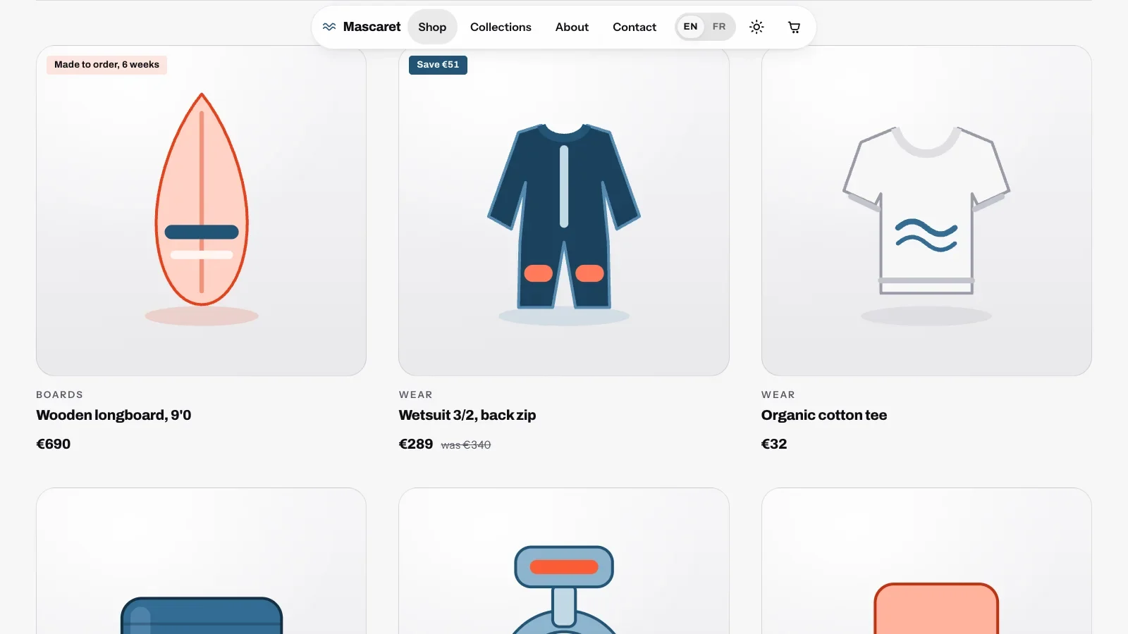
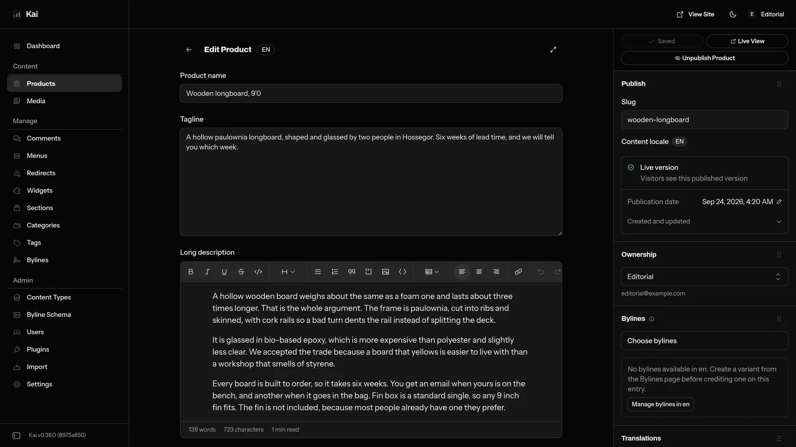
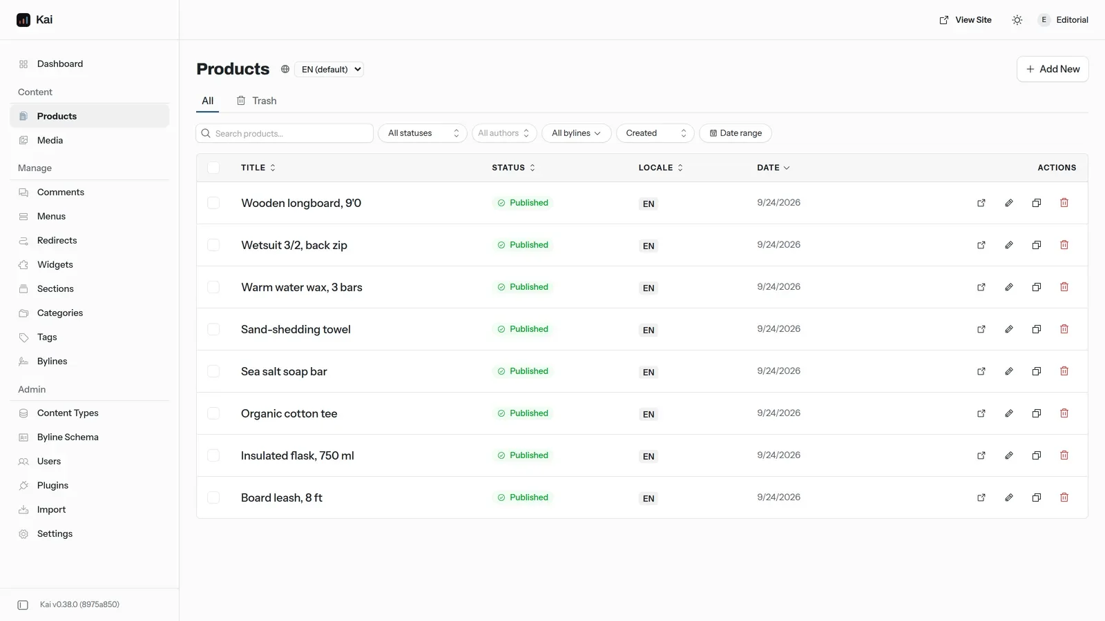

Built for independent shops and their agencies. Kai ships 38 static pages in English and French, light and dark, with a filterable catalogue and a cart. Turn on the optional EmDash engine and the shop runs from /_emdash on your own Cloudflare account: products and stock per option, Stripe Checkout, orders, refunds, invoices and a Shipping screen with weight brackets and a free shipping threshold. It also edits page texts, logo, colours, typefaces, SEO files and a maintenance page, without a rebuild. Capacitor configuration is included; native builds and store submission remain your responsibility.
Kai - eCommerce & Shop Theme with EmDash
Kai is a bilingual Astro 7 shop theme with eight products, four collections and a cart. Its optional EmDash back office runs the store: products, stock, Stripe Checkout, orders, refunds, shipping rates and invoices.
Other themes to consider
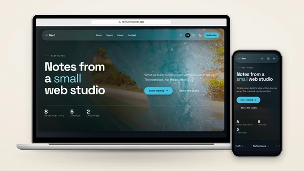
Reef - Blog & Editorial Theme with EmDash
Reef is a free, MIT-licensed Astro 7 blog theme in English and French, light and dark. Posts, topics and authors live in Markdown, or in an optional EmDash back office that publishes without a rebuild.
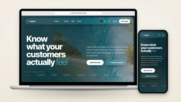
Aloha - SaaS & Dashboard Theme with EmDash
Aloha is a bilingual Astro 7 SaaS theme: home, features, pricing, integrations, a blog, sign-in screens and a read-only dashboard demo. An optional EmDash back office publishes posts and page copy without a rebuild.
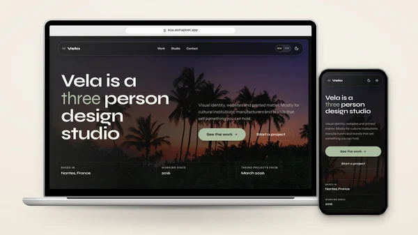
Koa - Portfolio & Studio Theme with EmDash
Koa is a bilingual Astro 7 portfolio for studios and designers: six case studies, a project index filtered by discipline, a studio page and contact. An optional EmDash back office publishes projects without a rebuild.
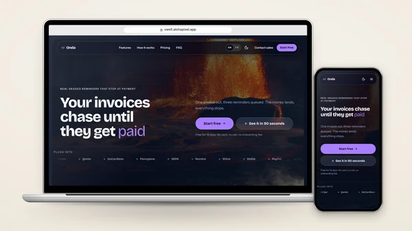
Swell - Landing Page Theme with EmDash
Swell is a bilingual Astro 7 landing page theme: a sales page in nine sections with pricing, testimonials, FAQ and a scroll-driven closing scene. An optional EmDash back office edits every section without a rebuild.
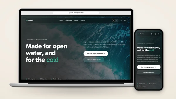
Nalu - Headless WooCommerce Theme with EmDash
Nalu is a bilingual Astro 7 storefront for an existing WooCommerce shop. It reads the public Store API at build time, with no API key or GraphQL, and sends checkout back to WooCommerce, which keeps orders.
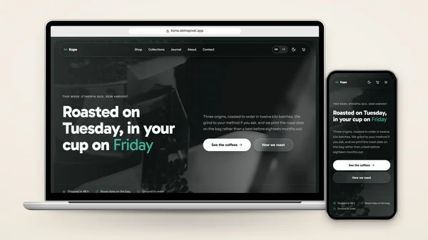
Kona - Headless Shopify Theme with EmDash
Kona is a bilingual Astro 7 storefront for an existing Shopify store. It reads the store's public catalogue JSON at build time, with no app or Storefront token, and sends checkout to Shopify through a cart link.