
For just over three years, Astro has been on a mission to empower the web development community to build a better web. We have undergone plenty of changes over the years, most recently with the release of Astro 2.0. Today, we are proud to unveil a new look and feel for Astro!
The Journey Awaits
Astro’s brand has always been rooted in the idealism of the early internet. Being a web developer was the ultimate super power. For the first time in human history, you could create and share digital experiences around the world instantly.
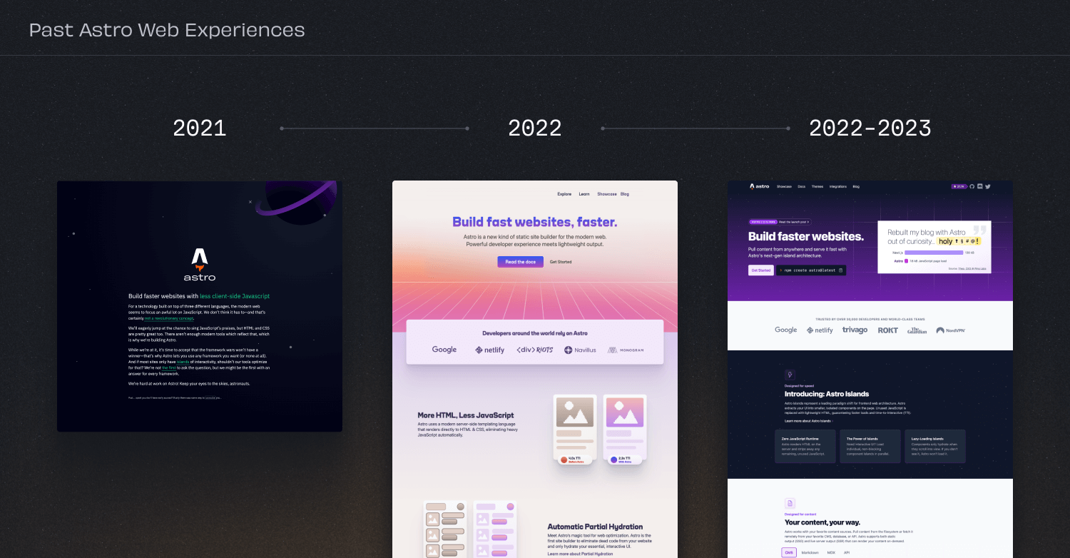
Over the last three years we’ve been through several iterations of our website and visual style. Our first website was just a single-page manifesto of the Astro vision and a hidden console.log easter egg to join a secret early-access Discord.
We’ve come a long way since then, and Astro deserves a visual look-and-feel that reflects our vision for the next three years. We partnered with Jessica Streiloff and her team at Streiloff & Co to help us create a new look for Astro that felt modern without losing that idealism of the early web.
For three months we went on a journey to understand what Astro meant to us. We interviewed our community, including core maintainers and power users of Astro. We looked at our past and our future. After digesting all the feedback that they had gathered, Jessica’s team came back to us with a storyboard concept that really clicked.
Ready For Takeoff
Our updated brand has several components. Let’s take a closer look at each one.
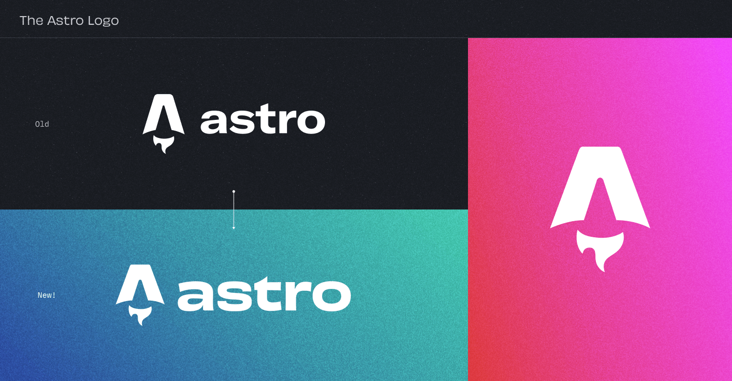
Logo & Mark
The logo only required minor refinements, such as adjusting the shape of the mark and improving the type for better readability. For example, the previous mark was visually difficult to center. The new logo improves on this with some lighter manipulations and spacing updates.
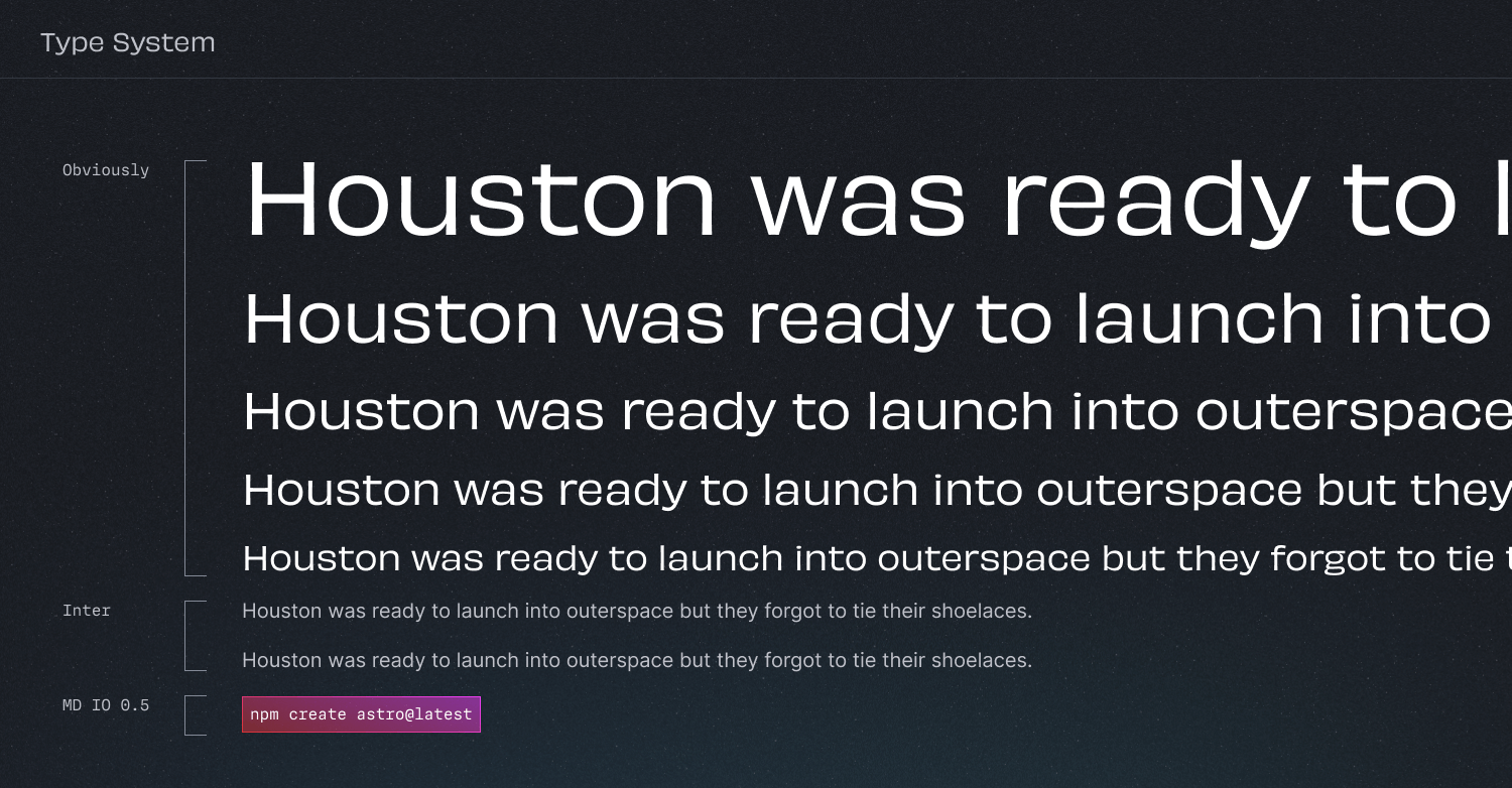
Type System
Typography is something that we deeply care about within our team. We chose typefaces that are optimized for legibility but also reflect the vibrant personality of our brand. We chose OH no Type Company’s Obviously as our main font for its versatility and bold personality. As a developer-focused platform it was also essential that we select an excellent code typeface, so we went with MDIO from Mass-Driver.
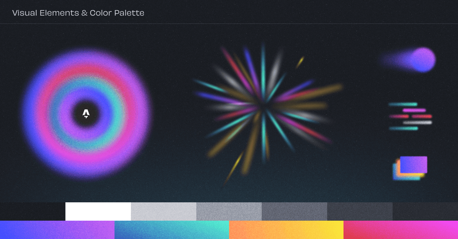
Visual Elements & Color Palette
We emphasized the importance of not looking like every other devtool out there when it came to the aesthetics of our brand. Dark-mode websites are very “in” right now, but we chose to pair one with a unique color palette and original illustration style.
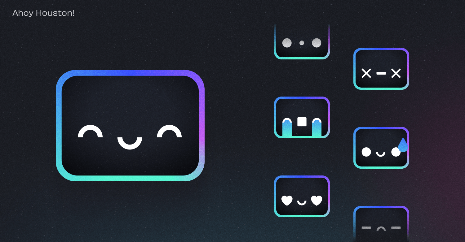
Introducing: Houston
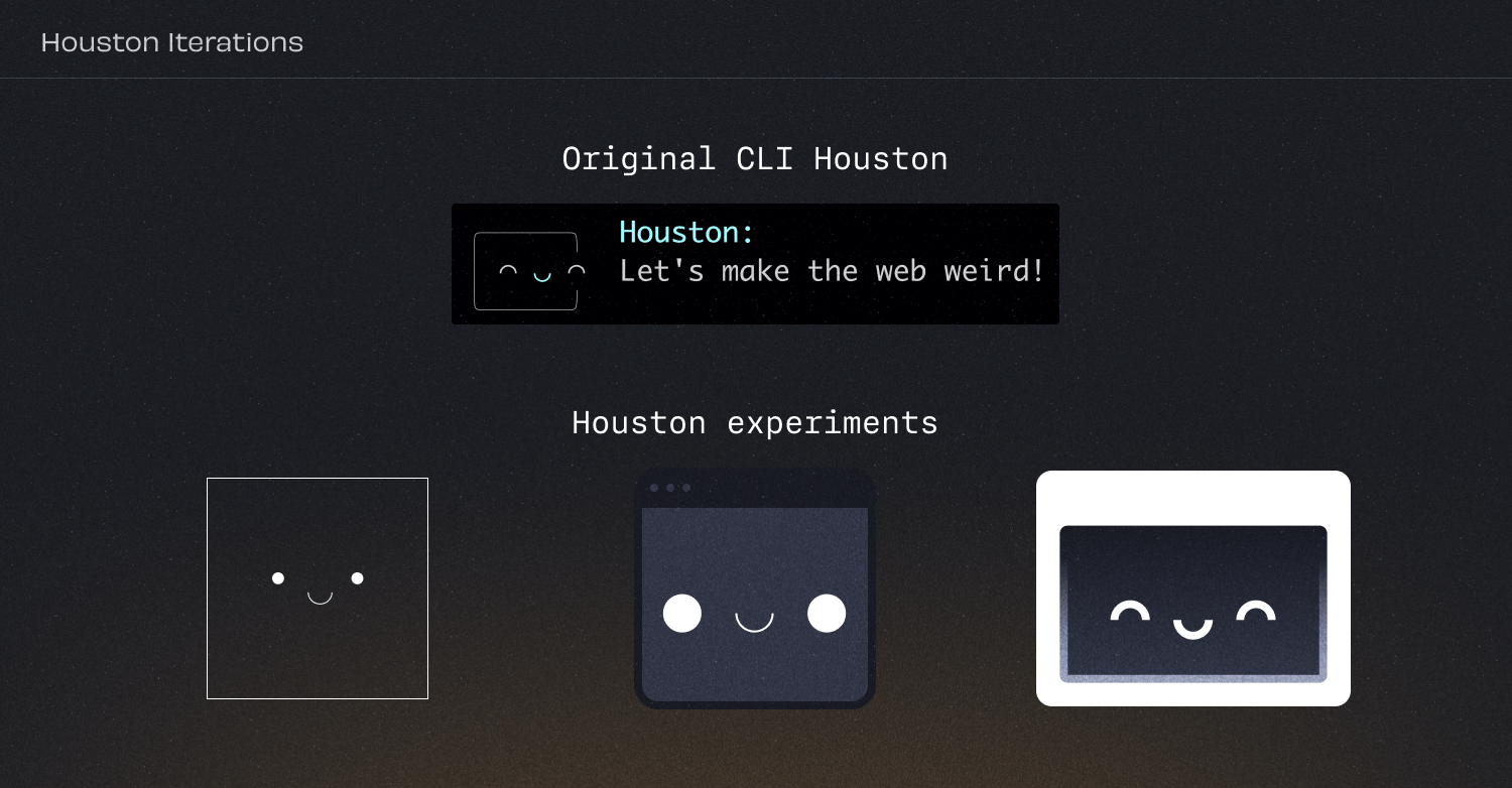
If you’ve been following Astro for the last few months, you’ve probably already been introduced to Houston, our friendly Astro mascot. He’s been featured recently in everything from our experimental AI assistant to our redesigned error dialog inside of Astro itself.
What you might not know is that we discovered Houston almost by accident. Nate Moore had added an original “blob” to our npm create astro helper CLI to add a bit of personality to an otherwise boring “getting started” tool. Jessica at Streiloff & Co loved this, and pushed us to think of the little fella’ as more than just a one-off.
We worked through several iterations of Houston before we found a personality that reflected how we saw Astro itself: whimsical, approachable, and friendly.
Houston may seem a bit square, but his visual simplicity is his strength (much like Astro itself!). With such a flexible foundation, Houston can be dressed up for any occasion or emotion:
See You Out There, Astronaut
We hope you enjoy this rebrand as much as we do! As we continue to evolve, so will this look and feel. Stay tuned for more deep dives and explorations of the Astro brand.
We hope to make our design system fully open-sourced in the future. In the meantime, to download our brand assets you can head over to our new press page.